Reference Frames
基準枠
Kijunwaku
CATEGORIES
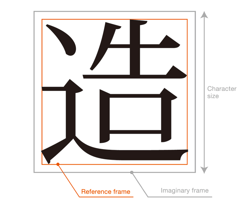
A reference frame is a frame constructed within an imaginary body that would coincide with the outer edge of the surface of a piece of type. The font is designed within this reference frame.
It is not simply the case that a character can be designed within a reference frame; the proportion of each character must be considered, sometimes designing it slightly smaller than the reference frame, sometimes slightly exceeding the reference frame. For example, if the character 国 were made the same size as the character 今, completely filling the reference frame right to its edges, the character 国 would appear larger. Fundamentally each character within the same font set should appear to be the same size; as a result 国 must be designed slightly smaller than the reference frame. For the same reason, the character 体 would be designed with the outwardly sweeping strokes projecting slightly beyond the reference frame. Character design must be adjusted to appear to be of uniform size. Similarly, characters in the Japanese syllabary (kana) also tend to appear larger, so they are designed using slightly smaller reference frame than those for Chinese (kanji) characters.
In this way the reference frame is used as a standard by which to determine what size a given font will actually appear, and thus is a central element to reflect the concept behind a font design. To this end, while the imaginary body is unified in accordance with JIS standards, the reference frame can vary slightly depending on the maker and the given font.
RELATED PAGES
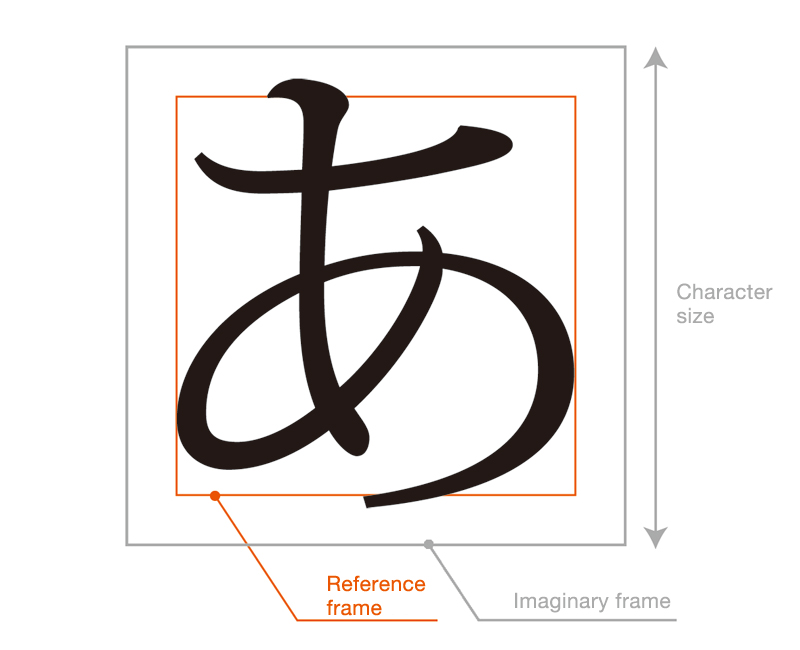 Kana are normally designed slightly smaller than kanji