Imaginary Body
仮想ボディ
Kasoubodi
CATEGORIES
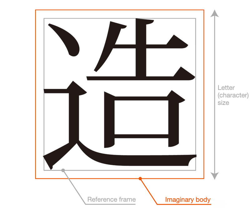
Imaginary body refers to the frame that will be the size standard when designing a font. A 12-point (1 point = 0.3514mm) font, for example, will be designed within a 4.217mm x 4.217mm frame. That frame is the imaginary body. The size of the letter is indicated by the size of the imaginary body. However, that does not mean that the font is created large enough to fill the imaginary body. Rather, it is created within another smaller frame (reference frame) set inside the imaginary body. Having an imaginary body, i.e. a frame that is larger than the actual letter, stops two successive letters from crowding each other.
The correlation between the size of the imaginary body and the size of the actual letter (typeface) has a great bearing on the size of the spaces between letters. For example, the alignment of letters with imaginary body frames is called solid typesetting. In Japanese fonts, if the letters are closely aligned in this way, there appear to be spaces between the kana characters while the spaces between Chinese characters appear closed up. This is due to the fact that kana characters are created in a smaller reference frame than Chinese characters when designing Japanese fonts and the space between the typeface and the imaginary body is more open than with Chinese characters. There are also small typefaces that include Sokuon characters such as the small “tsu” (っ) and “yu” (ゅ) and, when they are used in combination with particularly conspicuous letters in headers, etc., the character spacing will need to be adjusted from the solid typesetting alignment to take into account the typefaces of the individual characters. Looking at the proportion of the individual typefaces like this and achieving a finely balanced combination is called proportional typeface. Depending on the font, an imaginary body may have characters of different sizes even though they may be the same character. When those characters are combined, some fonts appear to have spaces while others appear closed. However, when we talk about character size, we are always referring to the size of the imaginary body and not the typeface.
The term, imaginary body, comes from the days of movable type printing. The typefaces used in letterpress printing were metallic and made mostly of lead. Therefore, they had a real, physical body rather than an imaginary one. Consequently, it wasn’t possible to close up the character spacing from the solid typesetting alignment. With the onset of phototypesetting and the ability to create typesetting by computer, the physical “body” disappeared and the imaginary body came into being, making it possible to close up and overlap characters at will.