Typeface Design
タイプフェイスデザイン
Typeface Design
CATEGORIES
The word “typeface” originally referred to the face of a piece of metal type; from that it came to designate a uniform style of design shared by a set of type. It is now used for the digital fonts that are used on computers in place of physical movable type. In Japanese it is called shotai(書体).
Typefaces have been produced in a variety of designs since the invention of printing. They can be roughly divided into around ten categories, including minchō-tai, goshikku [Gothic]-tai, and kaisho-tai for Japanese, and Roman and Sans-serif for European languages. The best typefaces created in each age tend to last for centuries, with many designs still in use today having been converted to digital fonts.
Typeface design during the era of movable type involved the carving, by craftsmen, of each character, in each size, in each font, directly into wood or metal. A matrix would be made in this way, which would then be used to cast movable type in lead. Later, this was done by mechanically tracing an over-sized model character that had been written on paper; the tracing motion could then produce a matrix in the necessary movable type size. During the period of photocomposition that followed as well, each character was drawn individually on paper using a drafting pen. The process of producing a typeface requires not only that the elements of a given character maintain a sense of uniformity, but also that all of the characters appear to be uniform in size and thickness. As such, it requires fine adjustments based on how the characters appear to the eye. This used to be left entirely to the aesthetic and technical ability of the craftsman who carved the original character. Today this specialized job is done by a typeface designer who works on a computer monitor, but who must have the same aesthetic consciousness toward the sensibility of the age. Because each typeface is closely linked to its original purpose and to the social background of the age in which it was produced, it is best to choose a typeface that is appropriate to its application.
RELATED PAGES
- An example of Japanese font style
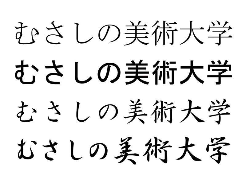 From top to bottom: minchō-tai, goshikku-tai, and kaisho-tai
 - An example of Western font style
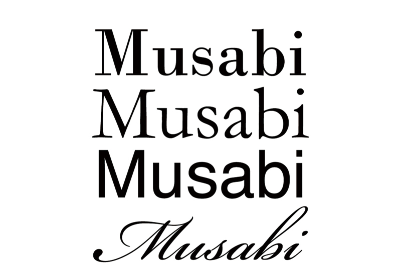 From top to bottom: modern Roman, old Roman, sans serif, script